
The dashboard answers one question for SDOT operations: on a World Cup match day, how is traffic around Lumen Field behaving compared to a normal day? Everything on the page is one of two measurements, compared against a baseline (a typical non-event day) for the same time of day:
- Traffic volume - how many vehicles are moving through, from 18 intersection & bridge count locations.
- Travel time - how long it takes to drive each corridor, from 21 Iteris ClearGuide routes (12 physical corridors, both directions).
Those locations are grouped into four areas - SODO/Stadium, Central Business District, Crosstown (Mercer/Denny/Yesler), and Ship Canal Bridges - so you can read the network as a whole, drill into an area, or look at a single location.
Each of the 18 count locations records a 15-minute vehicle count - every vehicle entering the intersection or crossing the bridge screenline, all approaches and all vehicle classes, with no filtering by direction. Those 15-minute counts are the raw material for every volume number on the page.
How a volume number is built
When you select a period (say egress), a volume figure is the total vehicles over that whole window:
- A single location = the sum of its 15-minute counts across the window (every 15-minute count from the start of the period to the end).
- An area = the sum of every location in that area over the same window.
- The whole network = the sum of all 18 locations over the window.
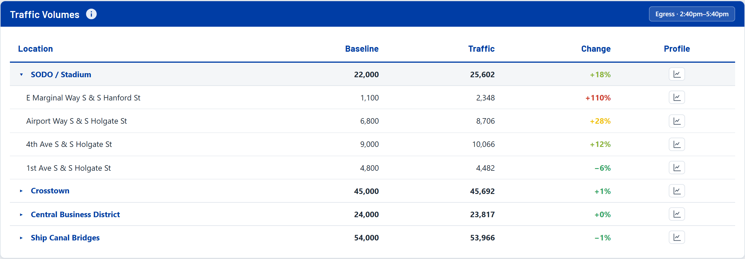
So with Egress selected, the SODO total reads 25,602 veh - about 25,600 vehicles entered the SODO count locations during egress that day (2:40-5:40 PM). The selected period and its clock range are shown in each section's header (for example "Egress . 2:40pm-5:40pm"), and the unit sits next to the number.
--- instead of a misleading total.Travel time comes from Iteris ClearGuide. Each route reports the average minutes to drive that corridor segment, in 15-minute steps through the day. Unlike volume, travel time is always an average - you report a typical trip length, you don't add trips together.
How a travel-time number is built
- A single route = its average drive time over the selected window.
- An area = a length-weighted average of its corridors, so a long corridor counts more than a short stub and one short segment can't dominate the number.
One corridor, two directions
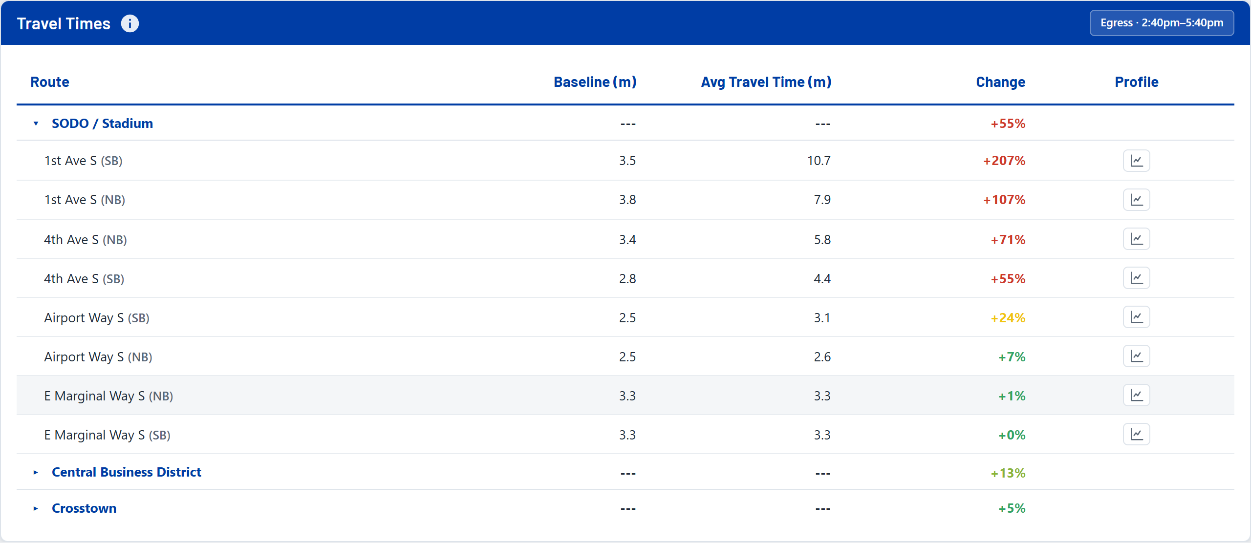
On the map, each physical corridor is drawn once, colored by the average of both directions, to keep the picture readable. In the Travel Times table at the bottom, the same corridor is broken out by direction (e.g. NB and SB listed separately) so you can see directional detail - which is why the table can list two rows where the map shows one line.
Every actual number is shown against a baseline: what this location or corridor normally does at the same time of day on a comparable non-event day.
- How it's computed: for each 15-minute slot, the baseline is the average across several comparable non-event days - so it's a smooth typical-day profile, not a single arbitrary day.
- Weekday vs weekend: baselines are split into weekday and weekend, and a match is compared to the matching day type.
- Excluded days & intervals: known-bad days or intervals (holidays, sensor outages, other big events) are excluded from the baseline so they don't distort "normal." Excluded items read as
---. - Rounding: baseline volumes are shown on a "smart rounding" ladder (to the nearest 5 / 10 / 100 / 1,000 depending on size) because a baseline is an estimate of normal, not a precise count. The actual match-day number is shown unrounded.
The core signal of the dashboard is the change from baseline - the actual compared to normal, as a percent. Positive means heavier than normal (more volume, or longer travel time). That percent drives the color of every dot, line, and tile through a five-step ramp:
The percent is computed over the whole selected window: total actual versus total baseline (for volume), or average actual versus average baseline (for travel time), across the same covered intervals. An area or the network takes the worst of its volume and travel-time change for its band, so the color never under-states what's happening underneath it. The same colors drive every dot, line, and tile, and are keyed in the map legend (bottom-left).
Two strips sit at the very top: the deep-blue header bar (pinned as you scroll) and, just below it, the match-day banner for the selected match. They carry different things.
Deep-blue header bar
| Element | What it means |
|---|---|
| Weather | NOAA AM/PM forecast for the match day (conditions + temperature), shown top-right. |
| Data through | The newest data point the dashboard holds (the most recent 15-minute interval with counts). Because DERQ data arrives with a vendor latency, this can sit behind the current clock. The page re-queries the warehouse on each load. |
| Match tabs | The six match days. A "More dates" drop-down opens non-match days for baseline context. |
| Ops Notes | Opens the drawer with the day's TOC note, weather, and incident list. |
Match-day banner
| Element | What it means |
|---|---|
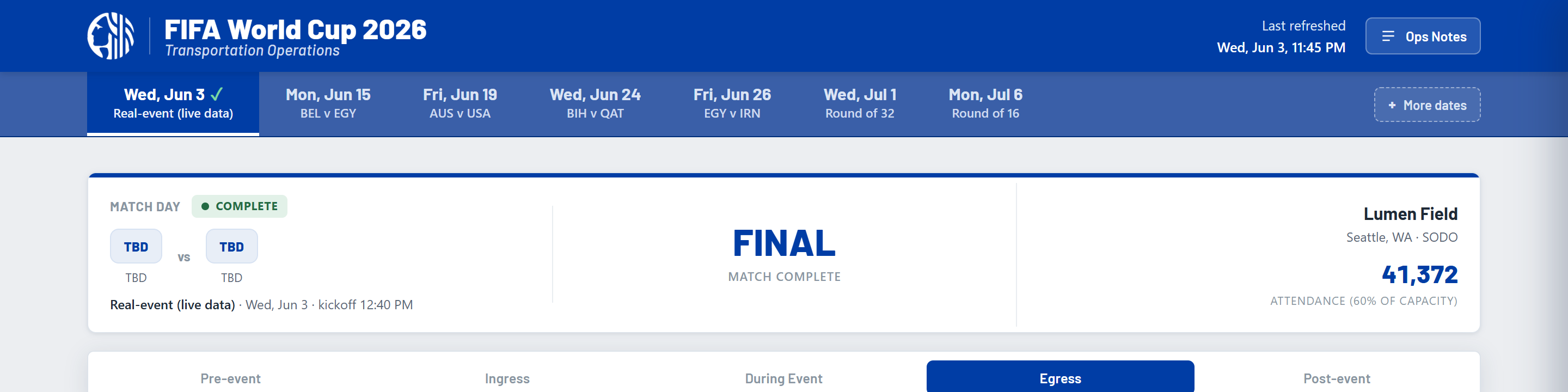
| Status | Upcoming, In progress, or Complete for the selected match day. |
| Teams & kickoff | The matchup and the kickoff time. |
| Countdown / LIVE | Time to kickoff before the match; "LIVE" with the current phase during it; the final state after. |
| Venue | Lumen Field, Seattle (SODO). |
The period selector sits under the header and controls the time window for the whole page - the map colors, the tables, and the KPIs all read whatever period is selected. The five periods are anchored to the match's kickoff:
| Period | Window | What it captures |
|---|---|---|
| Pre-event | 2 hours before ingress | The run-up before fans start arriving. |
| Ingress | 3 hours before kickoff | Fans arriving (gates open ~3h prior). |
| Kickoff | ~2-hour match | During the match itself. |
| Egress | 3 hours after the match | Crowds leaving - usually the heaviest impact. |
| Post-event | 2 hours after egress | The network settling back to normal. |
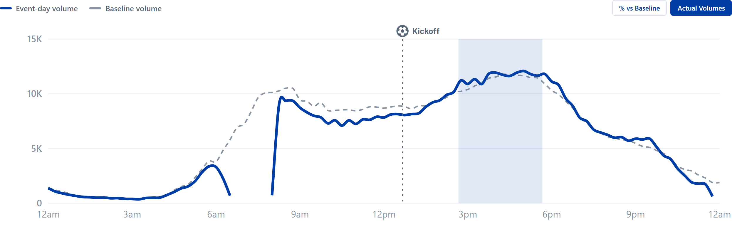
This chart shows the network's volume across the entire day. It has two modes:
- Actual Volumes - the match day (solid line) against the baseline (dashed). The gap between the lines is the event impact.
- % vs Baseline - the same thing as a percent change, where the 0% line is a normal day.
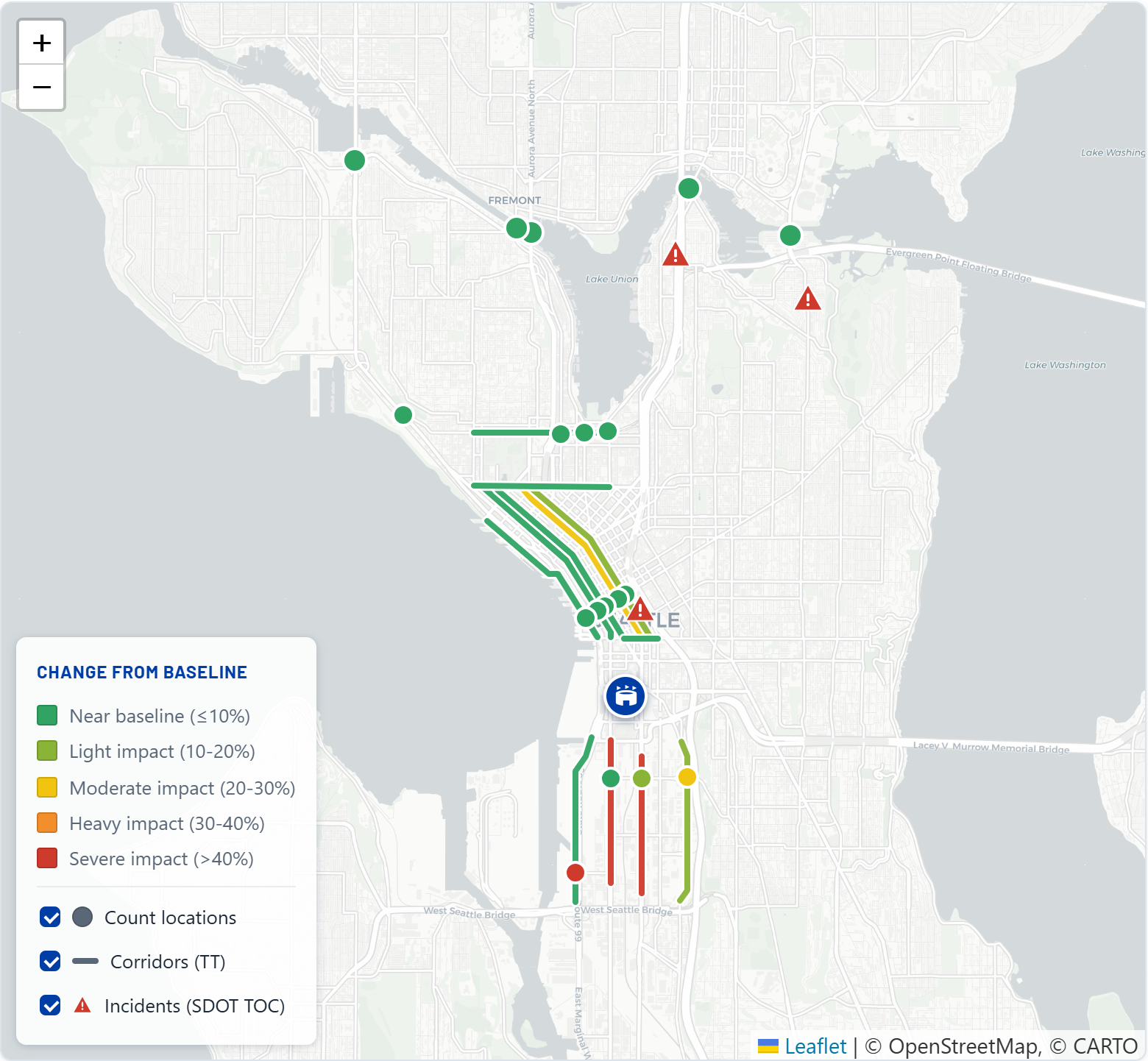
The map shows the real network, colored by how far each feature is from baseline for the selected period:
| Symbol | What it is |
|---|---|
| Dots | The 18 count locations. Color = volume change from baseline. |
| Lines | The 12 physical corridors. Color = travel-time change (both directions averaged). |
| Red triangles | SDOT TOC incidents active during the selected window, placed at the incident location. |
The legend (bottom-left) keys the five impact-band colors and lets you toggle each layer. Hover any feature for a tooltip with its name, the baseline-vs-actual numbers, and (for count locations) a satellite thumbnail.
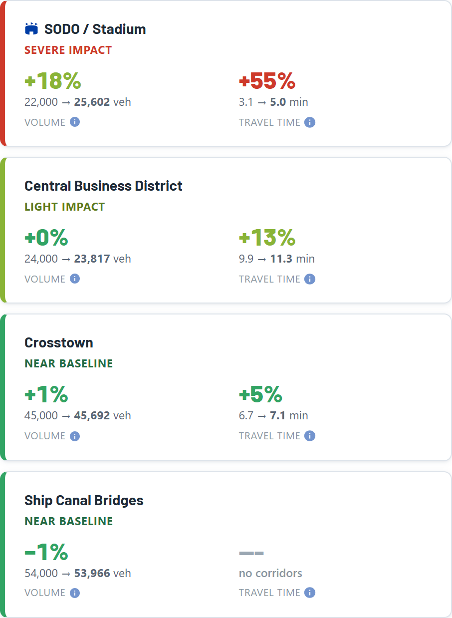
One KPI tile per area summarizes the selected period:
- Volume vs baseline - the area's total volume for the window against its baseline total, with the percent change.
- Travel time vs baseline - the length-weighted average travel time across the area's corridors, against baseline.
- Each tile is colored by its impact band and shows baseline first, then the actual (the actual bolded).
Below the map, two tables give the numbers behind the colors. Both follow the same layout, sorted by impact (worst area first):
- Traffic Volumes - one row per area; expand an area to see its count locations. Columns: Baseline, then Traffic (the actual), then the % change, then a profile button.
- Travel Times - one row per area; expand to see each corridor by direction. Columns: Baseline (min), Avg travel time (min), % change, profile.
Both tables read the selected period. Volume cells are window totals; travel-time cells are window averages. Rows marked --- are excluded or have no data for the window.
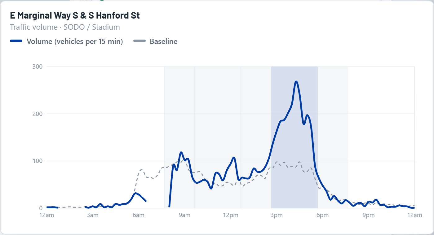
The profile button on any row opens a day-profile chart for that feature - its value across the whole day, actual versus baseline, in absolute units (vehicles for a count location or area; minutes for a corridor). It's the same idea as the big chart at the top, scoped to one location, area, or corridor.
- Count location -> its vehicle volume through the day.
- Area -> that area's total volume through the day.
- Corridor -> its average travel time through the day.
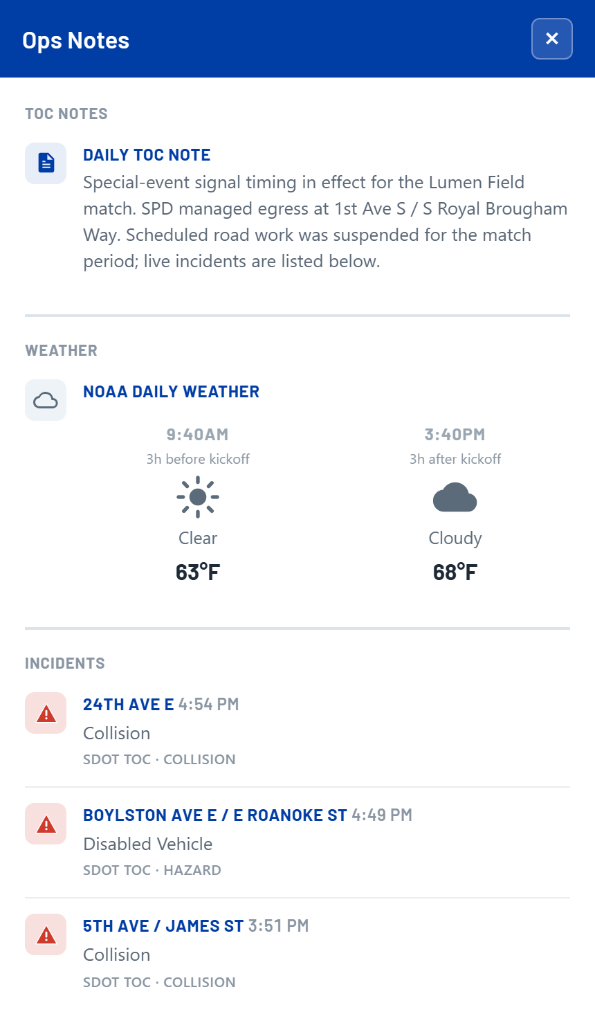
Incidents come from the SDOT TOC feed, filtered to those active during the selected window, of the relevant types (construction is excluded), and within the monitored network. Each lists its cross-street location, time, and description, and plots as a red triangle on the map. The citywide feed is geographically filtered so only incidents near the monitored corridors and count locations appear.
The Ops Notes drawer (top-right) collects the day's TOC notes, the NOAA forecast, and the incident list - the qualitative context behind the numbers.
How transportation data flows into the SDOT World Cup operations dashboard: each external feed lands in the Databricks warehouse, where it is ingested, cleansed, and modeled, then served to the dashboard by an Azure Static Web App.




- Medallion architecture: Bronze to Silver to Gold
- Raw ingestion through cleansed, conformed tables
- Timeseries fact + location dimension tables
- Match day vs baseline metrics
- Geocoded, validated locations
- Serves this operations dashboard
- Managed
/api/datafunction - Databricks credentials held server-side
- Live query on each page load
Baseline windows were set by SDOT (June 10-12, 2026). Baselines are a straight average per 15-minute interval, split by day type: a weekday view compares against the weekday average, a weekend view against the weekend average.
| Scope | Baseline window | Weekday days | Weekend days | Notes |
|---|---|---|---|---|
| All locations & routes (default) | Jun 4 - 10, 2026 | Jun 4, 5, 8, 9, 10 | Jun 6, 7 | Standard window for every count location and travel-time route without an adjustment below. |
| University Bridge | May 28 - Jun 3, 2026 | May 28, 29, Jun 1, 2, 3 | May 30, 31 | Window set by SDOT (June 12); the count data transferred well here with only a few small holes, left in. Spans a weekend, so this location now has both a weekday and a weekend baseline. |
| Fremont Bridge | Jun 3 - 9, 2026 | Jun 3, 4, 5, 8, 9 | Jun 6, 7 | Jun 10 replaced with Jun 3 per SDOT (camera moved Jun 10). |
| Date | Locations | Window | Data Source | Reason |
|---|---|---|---|---|
| Jun 4 - 10, 2026 | University Bridge | Full days | DERQ (counts) | Camera outage documented by SDOT; excluded from display. The baseline window for this location (May 28 - Jun 3) is entirely before the outage, so the baseline is unaffected. |
| Jun 10 - 11, 2026 | Fremont Bridge | Full days | DERQ (counts) | Camera moved Jun 10 and undercounted through Jun 11; excluded from display at SDOT's request. The baseline window for this location (Jun 3 - 9) is entirely before the move, so the baseline is unaffected. |
| Jun 3, 2026 | Fremont Bridge | 6:30 AM, 8:00 AM bins | DERQ (counts) | Two morning 15-min counts read far below the surrounding days (degraded partials). Jun 3 is inside this location's baseline window (Jun 3 - 9), so these undercounts were pulling the baseline down; dropped at SDOT's request (6/15). Neighbouring full bins are kept. |
| Jun 3, 2026 | University Bridge | 6:15 AM, 6:30 AM bins | DERQ (counts) | Two morning 15-min counts read far below the surrounding days (degraded partials). Jun 3 is the last day of this location's baseline window (May 28 - Jun 3), so these undercounts were pulling the baseline down; dropped at SDOT's request (6/15). Neighbouring full bins are kept. |
| Jun 23, 2026 | Aurora Bridge | Full day | DERQ (counts) | Camera outage (~5:30 AM - 1:10 PM) documented by SDOT; excluded from display. Jun 23 is after all baseline windows, so the baseline is unaffected. |
| Jun 23 - 26, 2026 | Fremont Bridge | Full days | DERQ (counts) | Outage from Jun 23 (~5:30 AM); data not flowing Jun 24 - 26 (documented by SDOT). Excluded from display; after all baseline windows, so the baseline is unaffected. |
| Jun 23, 2026 | 1st, 2nd, 4th & 5th Ave & Madison St | Full day | DERQ (counts) | Camera outage (~9:00 AM - 1:30 PM) documented by SDOT; excluded from display. Jun 23 is after all baseline windows, so the baseline is unaffected. |